Heidelberg University Rebrand
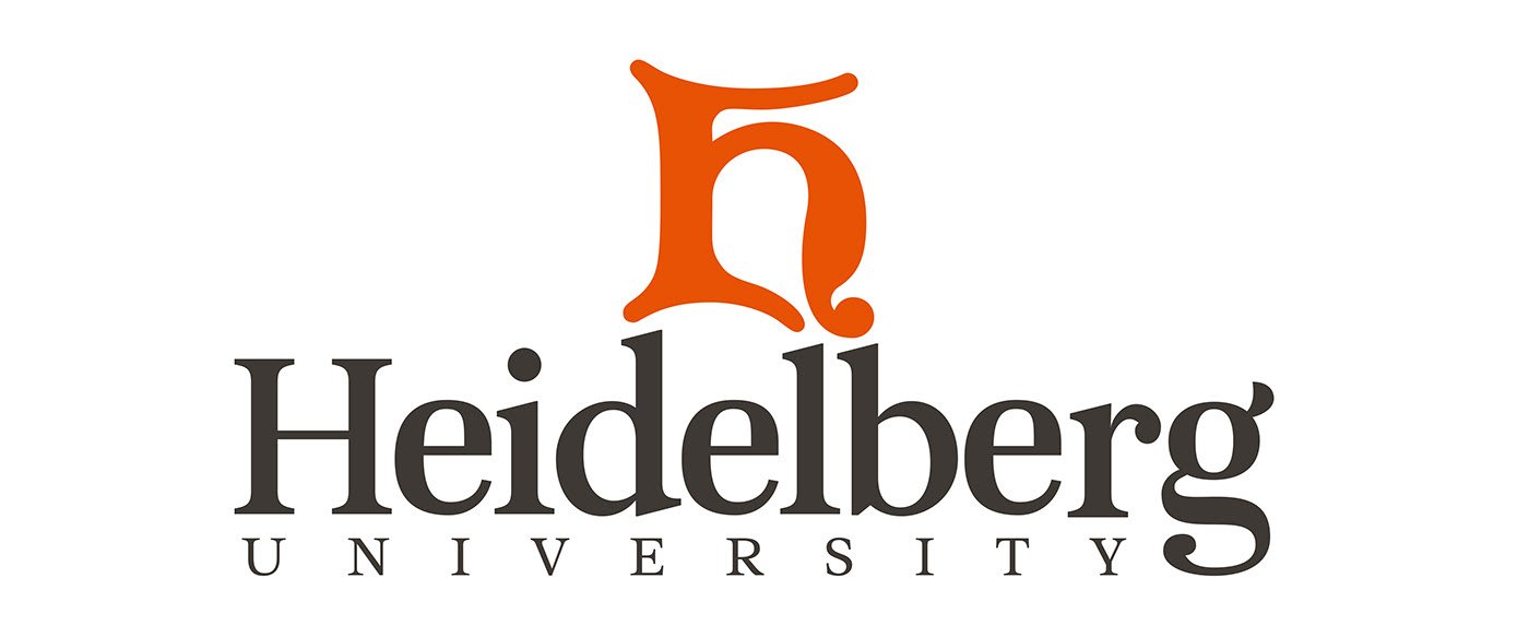
The goal in redesigning the Heidelberg University logo was to take the uninspired existing logo and create a visual for Heidelberg that incorporated our historical H logo mark and made it relevant and eye-catching in the modern world.

Enhancing the existing logo mark.
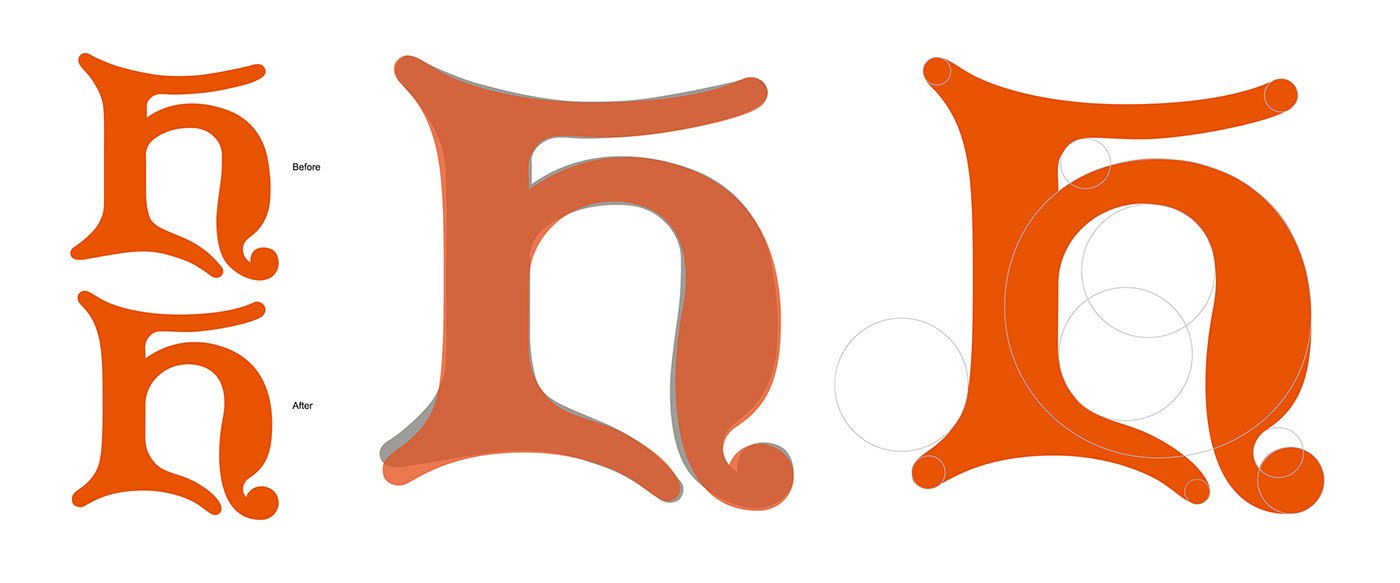
The H has been used throughout Heidelberg's history, first appearing on a class banner in 1914, and has had several iterations throughout the years. The most recent was soft, more round version, but the vector artwork was random and unclean. Above (left) you can see the subtle differences in the old (blue) and new (orange) H overlay.
To clean up the H, I used the relative measurements of the Fibonacci Sequence to not only give more meaningful structure to the vector artwork, but also to ensure it would interact well with the logotype.
Establish the word mark.
The existing visual brand guide outlined Leitura News as our primary type family. After several font studies and looking at how they interacted with the H, I felt that Leitura News should remain our primary serif type family. However, the plain text of Leitura News had lowercase 'e', 'r', and 'g' letterforms that didn't reflect my ultimate vision for what Heidelberg's logo should look and feel like (top).
With inspiration from characters from the previous font studies, I was able to craft these letterforms and create a word mark that reflects the historical modernity of the Heidelberg campus (bottom). The loop height of the 'g' was created specifically to provide a baseline for the word university.
Putting the pieces together.
When centered on top of the word mark, the bottom points of the H interact well with the ascenders of the 'd', 'l', and 'b'. However, because of the structure of the H, the 'd' needed to be extended slightly so that the space between the 'd' was equal to that of the 'l' and 'b'.
Above you can see the subtle height difference of the 'd'.
The final logo was then applied to University stationery, signage, street banners, and apparel.


